Training organisations can apply to DVSA to run drink-drive rehabilitation courses for people who have been found guilty of drink-driving offences.
The courses are designed to stop people from reoffending, which helps everyone to stay safe on Great Britain’s roads.
Around 33,000 offenders were referred to courses between April 2015 and March 2016. It's important that there are enough courses to meet this demand.
It's our job to make sure that it's as simple, clear and fast as possible for organisations to apply to run these courses and follow the rules.
We'd fallen into the trap of giving far too much detail in the guides we published for these organisations. This is how we fixed it.
We'd been getting it wrong
The content we had on GOV.UK for these organisations was made up of 3 detailed guides, totalling more than a staggering 13,000 words. Detailed guides are used to answer specific, task-orientated user needs - usually for specialist or professional audiences.
These guides also had 18 downloadable files in them. It was overwhelming for users - and for us.
The content in some of those files was way out of the GOV.UK proposition - the remit for what should be published. For example, it gave advice on how to interview a prospective trainer:
When the candidate enters the room ensure that they are comfortable, for example, offer them a drink, and invite them to take their coat off, ensure that the sun is not directly in their eyes.
This type of content slows users down from finding what they needed. It's clutter.
Start with user needs
We went right back to the start and talked with Jenny Mayor, the subject matter expert, to actually work out the needs of users.
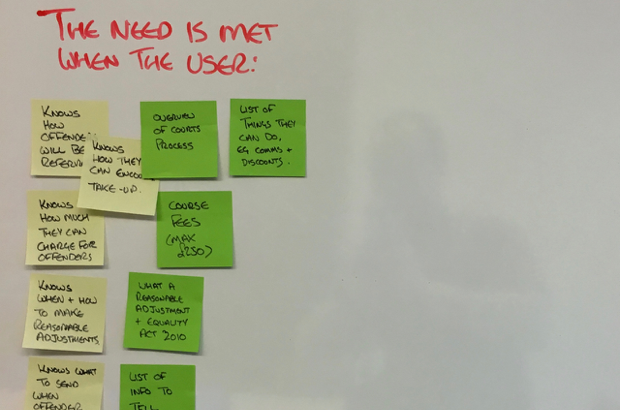
We had a useful session writing user stories, a list of acceptance criteria and the content we'd need.
We used Post-its on a board, moving them around to make sure we'd got the order right.

We also talked about the types of calls and emails the team got from training providers. We wanted to understand what actually generated contacts, rather than just making assumptions.
Here are the 2 user stories we had at the end of this work.
As a training organisation,
I need to set up drink-drive rehabilitation scheme courses,
So that I can provide approved training to offenders.
As an approved drink-drive rehabilitation scheme course provider,
I need to know the rules on running drink-drive courses,
So that I provide training that follows the rules to offenders.
Design around a user story
We then started to design the content we'd need. It was much easier because we had a list of exactly what was needed.
We could then apply all the best practice for writing for the web. We were particularly keen to do things like:
- make section titles active (such as 'Apply for course approval', rather than 'Applying for course approval')
- avoid technical terms in section titles, which means the contents list can be understood easily
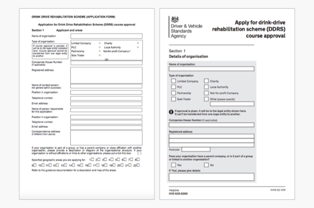
We also improved the application form to make it easier to fill in. In the future, the application process will become a digital service.

From 13,000 words to 3,000
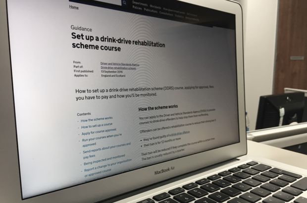
The content is now down to just over 3,000 words across 2 detailed guides, with 5 downloadable files.
The number of on-page searches has reduced as a result of the work. It suggests that users are now finding what they need more easily. The average time on the page has also reduced, which suggests the same.
We’re keeping a close eye on the analytics and user feedback, and we’ll continue working with the subject matter experts to make sure the changes are making things better for users.
Follow DVSA digital on Twitter and don’t forget to sign up for email alerts.