It's important to us that people can easily understand our organisation's purpose, vision and strategy. Being open lets people know what we're doing, why we're doing it and what we're trying to achieve.
I wanted to share the approach we took, using content design, to publish DVSA's strategy for 2017 to 2022.
Before I do, I want to point out that our clear vision for the future and overall strategy is the work of lots of people at DVSA - and none more so than Becky Thomas, Head of Planning, Performance and Strategy.
My role was to get involved early on so we could publish something that worked for users.
1. Make it easy to read
Writing great content clearly, in plain English, and optimised for the web helps people understand it.
Policy documents have traditionally been long, overly complex and full of jargon, but we were determined to write the content in plain English, to the GOV.UK style guide.
This wasn't about following rules - it was about doing something that we know works for people.
If people can't understand what we're going to do and what we want to achieve, we've already failed. We'd have made it harder for people to hold us to account for doing what we're supposed to be doing.
So we challenged ourselves to make every sentence as clear as possible. This involved multiple iterations, and also getting other people less familiar with our work to review the document (see tip 4!)
In the end, I think we more or less got there. But as any content designer will tell you, you often look at something a week later and think, "Oh, why didn't I describe this like that?" But sometimes, done is better than perfect.
2. Make it easy to access
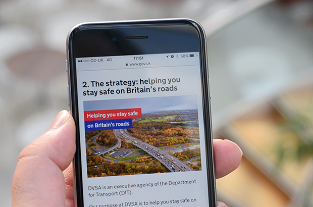
Our strategy is published in 2 formats on GOV.UK - there's a web page (HTML) version, and a PDF/A version.
With most documents I've worked on in the past, the PDF version has been designed first, and then it's been copied and pasted over to HTML.
But this time, we did it the right way around and designed the HTML version first.
We know around 60% of all our content is now viewed on a mobile device, so getting the HTML version right wasn't something I wanted to leave to chance.
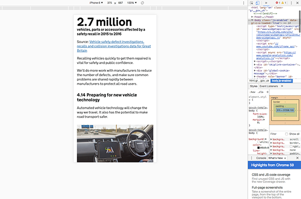
I spent most of my time working in a mobile device view in Google Chrome so I could see what mobile users would see. It helped me to make sure that paragraphs weren't too long, and that subheadings were regular enough to break up the text for someone doing a lot of scrolling.
As a result, I think it's something that feels nice to use on a mobile device.

The analytics show that since publication, there have been 9,669 pageviews of the HTML version, and 6,190 downloads of the PDF - roughly a 60/40 split between the 2 versions.
Of those viewing the HTML version, 51% were on a mobile or tablet - just slightly lower than our average. They spent an average of around 5 minutes on the page - which is around 30 seconds longer than users on a desktop.
3. Make it clear why we're doing what we're doing
A really important point we wanted to get across was why we're doing this work over the next 5 years. It's all about helping you stay safe on Great Britain's roads.
There’s all sorts of data, research and facts about road safety that we used to decide our strategy - so the challenge here was to pull it together without swamping people.
At one point, I had a door covered in post-it notes for a week as I tried to organise them in a way that would be easy for people to understand.
This really helped, as it was easy to keep moving things around until the order felt right. It also means that if there's ever a pub quiz where the length of Great Britain's roads comes up, I'll be sorted.
The supporting road safety section of the strategy shows the results of this work.
4. Get someone to help
When you've worked for an organisation for a long time, you can easily forget how weird some of its terminology is. You wrongly take it for granted that people know what something means, and can fill in the blanks about why that's an important thing. But that doesn't make good content.
So it was very important to us to get someone from outside of DVSA to be a critical friend to make sure that the document made sense.
I turned to the people who invented content design for help - the content team at the Government Digital Service (GDS).
I’m very grateful to Keith Emmerson at GDS for spending a day with me, going through the document section-by-section and line-by-line to make sure it made sense.
Having that extra challenge really helped to make sure that each sentence was earning its place in the document.
I can't emphasise enough how important this was - and it's something I'd definitely recommend to others. It doesn't need to be GDS - there are lots of people in the government content community who'd be happy to help.
Let's get better at writing strategies
I hope you've learned something from this post. But I really want to learn from you.
Let me know in the comments how you've gone about writing strategy documents, what problems you came across, and how you overcame them. And what are your ideas about how government can get better at writing these types of documents?
I'd love to hear from you.
Keep up to date with our work by signing up for email alerts or following DVSA digital on Twitter.
3 comments
Comment by juliachandler1 posted on
An interesting post - thankyou. And your experience pretty much mirrors ours when we put together the Libraries Taskforce strategy document: https://www.gov.uk/government/publications/libraries-deliver-ambition-for-public-libraries-in-england-2016-to-2021
We also have an html version, and a pdf - designed to be printed, as much of our core audience (council leaders and officials) still prefer that. We had numerous requests when we published the first version of the consultation document as html only. Also, the pdf version gave us the opportunity to use the exact same content, but with a design that made it much more attractive and the basis for a lot of accompanying advocacy materials.
One thing I might add to your tips, and its relevant if you create a final document after a long consultation, we made a point of adding a section that made it clear how we had created the final version - a sort of "you said, we listened" annex.
And one more technical point (which points more to my lack of knowledge about google analytics), you mention you have been able to track pdf downloads - can you share how? I've asked before, but no one has let me know the process!
Comment by John Ploughman posted on
Hi Julie
Thanks for the feedback, and sharing your work on and experience on Libraries Deliver. Your document looks great in HTML, and the PDF really benefits from having content that was designed originally as a web page.
The tip about making it really clear what's been done in response to public feedback from consultation is really important.
To track downloads from GOV.UK in Google Analytics, follow these steps when you're in Google Analytics.
1. Click on 'Behaviour' in the left-hand menu.
2. Select 'Events'.
3. Select 'Pages'.
4. On the right-hand side of the screen, under the graph, you'll see a field with a search icon next to it - paste in the URL of the page the documents are on and hit the icon - for example, /government/publications/libraries-deliver-ambition-for-public-libraries-in-england-2016-to-2021 (don't put in the https://www.gov.uk bit).
5. Click the page URL when it's found it.
6. Click on 'Download link clicked'.
7. You can then see the attachment URLs to see how many times each document was downloaded.
I hope that helps you do some more evaluation. Drop me a line at john.ploughman@dvsa.gov.uk if you'd like to know more.
Comment by juliachandler1 posted on
Many thanks John - I'll test that next time I run a report. Very glad we don't have many pdfs though!