Last Friday (17 February 2017), our 6-week consultation on proposals to improve motorcycle training closed. It's become our consultation with the highest proportion of mobile and tablet views ever, and in this post, we’re taking a look at why.
Getting views on plans to improve motorcycle training
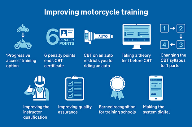
The consultation was about 9 main proposals to improve how training works for moped and motorcycle riders.
Some of the proposals were directly about motorcycle riders themselves. Others were about improving how motorcycle instructors qualify and are quality assured, so we can make sure that training is giving everyone the best start to help them through a lifetime of safe riding.
We received over 2,200 responses to the consultation, and our policy colleagues are now busy analysing the responses. The most recent comparable consultation on this topic received 350 responses.
Mobile in mind: publishing the consultation as a web page
A big part of our communication plan for this consultation was using social media. And we know that social media sends a lot of users from mobile devices to our content.
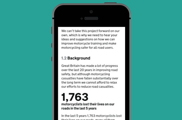
So we made the decision to publish the consultation as a web page (or ‘HTML’).
I've written before about the benefits of publishing content as web pages, rather than PDFs. All of those reasons applied here too - especially making things much easier for users on a mobile device.
Understanding context
Using social media to direct mobile users to download and struggle to read a PDF file wouldn't have been the responsible thing to do. It would have just frustrated a lot of users who were actually trying to engage with government.
So we did the right thing, by making it accessible to the widest range of users possible.
By the time the consultation closed, the main consultation page had been viewed 15,811 times, with 5,291 views of the consultation document itself.
This table shows the type of device used to view the main page.
| Device category | Page views | Percentage of total page views |
|---|---|---|
| Mobile | 10,105 | 64.39% |
| Desktop | 4,151 | 26.45% |
| Tablet | 1,437 | 9.16% |
Designing graphics for social media
We knew we'd need eye catching and clear graphics to use on social media to get people to stop, read and click to find out more.
We grouped the 9 proposals together in a way that made as much sense to us as possible. This mainly involved working out which directly affected riders, and which had more effect on instructors.
We had one graphic that brought together all 9 proposals with simple icons and short descriptions. We used this when talking about all the proposals.

We then used the icons individually when talking about specific proposals. Take a look at this blog post explaining the proposals, for example.
In retrospect, I think we could have made more use of those individual graphics throughout the campaign - but it's something we've learned for next time.
Creating video for social media
We knew that the only thing likely to attract more attention than a flat graphic was video.
So we picked 3 of the proposals that we felt most people would have an opinion on - regardless of whether they're a motorcyclist or not. They were:
- requiring learner riders who get 6 penalty points to take another compulsory basic training (CBT) course
- requiring learner riders to pass a theory test either before or as part of their CBT course
- giving motorcyclists the option of taking extra training to upgrade their licence to ride bigger motorcycles, instead of having to take extra tests as they current have to do
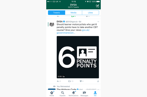
We then created a short 6-second video clip for each, with some suitable footage, fading to black with the same icon we were using for that proposal, to help things feel connected.
The purpose of the videos wasn't to explain the proposals - they were just to grab the user's attention.
Square video
We also made the video square, rather than the usual widscreen format. We did this because square video currently seems to perform better on social media - probably because it's much harder to miss, as it takes up more of the user’s newsfeed. You can watch an example clip on Twitter.

These 3 videos were used on Facebook and Twitter.
On Facebook, the videos were viewed 94,340 times. The video about upgrading a licence was viewed 69,102 times alone. Interestingly, 82% of those views came from users sharing the video, rather than seeing it on our page.
The analytics show us that Facebook referred most users to the consultation. Here are the top 5 sources of referrals to the consultation.
| Source | Page views | Percentage of total page views |
|---|---|---|
| 10,124 | 64.46% | |
| 1,147 | 7.30% | |
| Direct | 943 | 6.00% |
| GovDelivery (email alerts) | 829 | 5.28% |
| bennetts.co.uk (motorcycle insurer) | 561 | 3.57% |
What we've learned
Working on this consultation has helped us to learn a lot.
Here are the top things we're going to take away from this:
- mobile users will engage with us when we make the experience for them respectful - so we must publish consultation documents as web pages
- having a consistent visual language to refer to individual proposals in a consultation helps to tie things together across different platforms
- we should make better use of those 'icons' for individual proposals on social media, rather than just sharing a single graphic showing icons for all proposals
- square videos grab attention, which can lead to more shares, and more engagement with the consultation
We'd love to hear from you if you've been involved in running a consultation that's had a high take-up on mobile devices. What worked well for you? What would you do differently next time? Do leave a comment if you have anything to share.
Follow DVSA digital on Twitter, and don't forget to sign up for email alerts.
1 comment
Comment by Dominic posted on
Very interesting article! I particularly like the graphics - and the tip about the square video is great.